Monday 12 August 2013

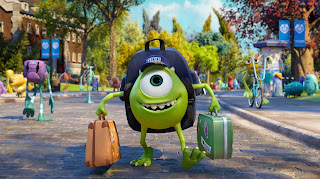
Monsters University

2013
Director: Dan Scanlon
Writers: Daniel Gerson, Robert L. Baird, Dan Scanlon

Ever since Pixar was taken over by Disney in 2006, something seems to have been happening with their films. Once they were making fascinatingly experimental and pretty out-there films like WALL-E and Up, but now one can't help wondering if the businessmen have started to take over. Any news now concerns sequels, with both Cars 2 and Monsters University coming out, and Finding Dory on the way. Considering just how poor Cars 2 was, having followed the already slightly disappointing Cars, it's easy to think all this is just a project to shift as much merchandise as possible. But we can't forget Pixar is no stranger to sequels, having made the brilliant Toy Story 2 and 3. So how will they fare in the world of the prequel?

Monsters University charts the story of Mike Wazowski (Billy Crystal) and James P. "Sully" Sullivan's (John Goodman) friendship from college up to the first film, when they're the top scarers at Monsters Inc. Mike, inspired to become a scarer after a school trip to Monsters Inc. as a cute six year old, works hard to get to university, despite not being a natural scarer. It all comes easily to Sully on the other hand, who lazily assumes he can make it without working. When an incident puts both of their places at uni at risk, they have to work together to win the prestigious Scare Games and get back on track. 

The best Pixar films create vast new worlds and within that populate it with rich lovable characters that have to complete a simple quest. From Finding Nemo’s race across the vast ocean to save a lost fish to The Incredible’s 1950’s inspired comic book adventure, they’ve shown how wonderfully it can be done. Monsters University definitely gets the first parts right. Everyone still loves Mike and Sully from their first adventure, and the campus in the film is an incredible sight, with a whole array of beautifully rendered monsters of all shapes and sizes. As you’d expect, every frame is simply gorgeous to look at.

The problem lies with the plot. What starts as a simple idea quickly multiplies into a rambling set of unoriginal set pieces, all relying too heavily on sports movie and college movie clichés. Like Homer Simpson says after watching too many of these films: “There are two kinds of college students- jocks and nerds. As a jock, it is my duty to give nerds a hard time.” Things are no different here, with Mike and Sully trapped on the side of the nerds, fighting against the world. All the action takes place on campus and, bar one scene venturing to Monsters Inc. itself, this severely restricts the film’s potential to explore exciting new settings and ideas like we know Pixar can do so well. These restrictions, and the sheer fact it’s a prequel, mean it’s not exactly hard to guess how Monsters University will progress which sometimes makes it hard to care.

But overall, does that really matter? Even substandard Pixar is so much better than the vast majority of animations out there, especially now it’s possible for any studio to create quick, cheap-looking computer generated cartoons easily. The amount of love and care that has gone into making this is as obvious as any of the other films. On top of that, it’s still a pretty funny film making good use of their tried-and-tested word play, visual humour and self-referential pastiche.


Monsters University is still a lot of fun to watch, and increasingly rarely in cartoons these days, a film that absolutely everybody can enjoy, here avoiding slipping into crude innuendo and knowingly nudge-and-wink territory designed to keep adults interested in films appealing only to kids. This doesn’t need that; Pixar still have that wonderful ability to make everyone feel like big kids again. It’s just disappointing when you think they can, and have done, so much better than this before. At the very least, it looks so much better than Planes, Disney’s new cash-cow tie-in to Cars. Plus Pixar’s next projected projects, The Good Dinosaur and Inside Out, both sound extremely promising.    


Saturday 27 July 2013

Saboteur

1942
Director: Alfred Hitchcock
Writers: Peter Viertel, Joan Harrison, Dorothy Parker

I'm sorry I've been neglecting you blog, just with exams and holidays and all I've been a bit distracted the last few weeks. Plus frankly in this time I haven't even watched that much, including having not been to the cinema in nearly two months, which I'll try to remedy soon. But for now, I figured this would be a good time to expand my viewing of some classic Hitchcock, starting with a boxset I have at home which has been unfairly ignored until now.

Saboteur is his oldest film in the collection and Hitchcock's first film with an all-American cast. I can hardly say I know much about Hitchcock, but this film definitely feels like a precursor to much of his later work; many of the same tropes and trademarks feature: a case of mistaken identity, the use of landmark locations, cross-continental travel, double crossing, beautiful blondes, repressed sexuality. Indeed, Saboteur feels very much like a lite version of North by Northwest or The 39 Steps

In this case, Barry Kane (Robert Cummings), a factory worker in an aircraft manufacturing plant is accused of sabotage after a fire envelops the factory, destroying all inside and killing his best friend. Forced to go on the run, he ends up coming into contact with this film's Blonde Pat Martin (Priscilla Lane), and they go on the lam together, aiming to find the real saboteurs behind the attack. Even just the plot is a working version of North by Northwest, although this in itself is not a bad thing. It's an immensely enjoyable film, very tightly packed together and rapidly paced to make this a short but sprightly experience, with no time wasted on meandering plotting or heavy character development.

Despite having a lower budget than he would later come to receive, Hitchcock still manages to create some notable setpieces: a shootout in a movie theatre and the climax on the Statue of Liberty being the standouts. However, it may be down to an under-developed script or a rushed scene but the very end of the film does feel very anticlimactic and brief, especially given what it follows.

What is unusual with this is just how American it actually feels. Of course much of Hitchcock's best work is set in big cities and small towns in the US, but due to the wartime context there are times when this lapses into blundering propaganda. It is interesting in how explicitly it chooses to reference the war, but Kane's journey across America where he learns the true nature of democratic kindness and an inherent love of one's neighbour from a kindly blind man and a trope of travelling circus freaks can feel heavy-handed at times. Occasional impassioned speeches and wonderfully devious double-crossing villains only serve to accentuate this. It feels more blunt when you consider Hitchcock made the fantastically nuanced and psychologically complex Shadow of a Doubt just a year later.

But these still remain different films. At heart, Saboteur is a perfectly acceptable pulpy thriller. It's very much a Hitchcock film, but this earlier work feels like a work-in-progress when compared to his later output. The plot is quite flawed at points, and some scenes had me questioning how characters would suddenly end up in different places instantly following some strange editing. But this may be down to its need to maintain its very lively pacing. In the end, I didn't care that this was a more undeveloped version of his later work; I had a lot of fun watching this and found myself greatly engaged by it. It's still an expertly shot film which makes great use of close-ups to create some notable tension. 

Tuesday 4 June 2013

The Great Gatsby

2013
Director: Baz Luhrmann
Writers: Baz Luhrmann, Craig Pearce

A film based on a novel about the wild excesses of the 1920s and its consequences both socially and economically, though numerous versions of The Great Gatsby have been made before, the timing of this one feels quite pertinent regarding the state of the world now. F. Scott Fitzgerald's iconic story has now been re-imagined by the frenetic and visually lush mind of Baz Luhrmann and it's harder to think of a more suitable director.

It's immensely beautiful to look at, filled with an incredibly rich décor of stunning art deco sets and costumes, and lots of very good-looking people. It takes the iconography of the 1920s and updates it, makes it feel new again. There have been questions about the use of the modern soundtrack but personally I think it works, conveying the sense of vibrancy and modernity revellers would have felt at Gatsby's lavish parties, something which couldn't have been translated to today's audiences through use of dated period music.

If Luhrmann was trying to express the atmosphere of this period of New York as being all surface and superficiality, then he undoubtedly succeeds. The party scenes, which surprisingly are quite infrequent, are filled with a heady aura of decadence as crowds of people perform for the swooping and glorifying cameras. But the rest of the film looks marvellous too, especially the depiction of New York itself, artificially digital-looking but still with the power to allure, filmed from the top of skyscrapers then BASE jumping down to the crowds below.

There is also the interesting contrast with the 'valley of ashes', the industrial wasteland between the glamour of the city and the decadence of West Egg. Its closeness belying the fragility of this aristocratic existence, the flip-side of the coin that provides the energy and the illicit means for Jay Gatsby (Leonardo DiCaprio) to create and maintain his lifestyle, as well as harbouring his and this whole society's downfall.

Yet much of this substance is lost beneath the surface. Despite the film continuously reminding us of how literary this story is through the use of prose literally written on the screen and the interesting addition of the story of Nick Carraway's (Tobey Maguire) writing process, the film remains visual at best. Gatsby's earliest scenes are brimming with stylistic excess- a simple sit-down lunch is filmed with endlessly sweeping and zooming cameras, accompanied by near constant cutting between shots to the point it becomes almost nauseating. Thankfully it calms down a lot after these scenes, but the building of the romantic plot is left to fill the gap, and prevalence for surface undermines this, rendering the more dramatic scenes later on slower and more distant.

Leonardo DiCaprio is excellent as the mysterious and layered Jay Gatsby but, as much as I love Carey Mulligan, her Daisy can't compete and thus their romance is left to feel cold. We are supposed to see Daisy the way Gatsby sees her with his undying all-consuming devotion, yet the film prefers to reserve its loving gaze for Gatsby himself, turning him into an omnipotent figure but leaving everything else feeling imperfect. By the end many of the characters are left to stand around in the background as Gatsby dominates- the developing relationship between Nick and Jordan Baker (Elizabeth Debicki) is barely given time to play. 

The heavy-handed use of motifs, especially the green light of the bay and the self-referencial all-seeing eyes, whilst important in expressing the themes of yearning and consequence, end up being forced down your throat like too many shots of champagne. By the end you can understand Nick's disgust with the lifestyle, but the film is so much in love with the look and feel of it all that this message is undermined. The characters we are meant to engage with are kept at a distance, and all we are left with are the surfaces to admire.

Saturday 25 May 2013

Brideshead Revisited

2008
Director: Julian Jarrold
Writers: Jeremy Brock, Andrew Davies


I try really hard to make sure that when I watch a film remake or even adaptation I don’t let my views of the original impact how I see the film. Yet I inevitably find that’s pretty much impossible to do- there’s very rarely been a film I’ve considered better than the book it’s based upon. And this problem has been exemplified for me by finally watching the 2008 big-screen version of Brideshead Revisited. Comparisons with the seminal 1981 TV serial are inescapable in pretty much all reviews I’ve read about it. Having both read the Evelyn Waugh novel and watched the serial, really liking it to the point that I chose to write an essay about it for my TV module, using these as comparison points was going to be inevitable.

Unfortunately, this meant that the 2008 version did not fare as well in my eyes. The serial is just so iconic and beautifully put together that any picture I conjure in my mind of Brideshead is of that show. Watching this film then just felt a bit… off. For me, Jeremy Irons is Charles Ryder and Anthony Andrews is Sebastian Flyte. Matthew Goode and Ben Whishaw both do perfectly great jobs in their respective roles; in fact all the performances are excellent. It’s just they couldn’t compete with the original conceptions for me. Even the teddy bear they got for Aloysius felt wrong! It’s sad that so many people’s perception of this film are so much under the influence of the TV serial, but that was just so with-it, perfectly capturing the very mood and feel of the novel.

This tries hard to recreate the sense of melancholy and nostalgia for youthful joys but just can’t match what has been done before. But even without that mighty expectation of matching the serial, this film just can’t truly convey the essence in the same way. Everything is seemingly held at arm’s length and in the end it just ends up at times becoming just a little bit, well, dull. There was no great change in me when seeing the transition from the playful days of Charles and Sebastian’s time together to Charles’s eventual marriage and later life, the mood just didn’t shift like it should. The framing device of Charles’s wartime visit to Brideshead is relatively absent from the film, making the rush of emotions he feels about the place feel less marked and definite. This makes me realise just how much insight Charles’s near omnipresent voiceover in the serial actually granted into the characters and the overall feelings of the time.

Of course the film has slightly different intentions and interests to the serial. Whilst that was more focused on Charles’s nostalgia for the past and about the decline of the aristocracy, the film prefers to explore the more modern sensibilities of the complexities of relationships, religion and sexuality. A lot of time is spent on the subtleties of Charles and Sebastian’s relationship; Sebastian is more definitely presented as homosexual in this but Charles instead is shown less questionably as heterosexual. The film skirts around the nature of their relationship which is implied in the novel as being romantic and possibly sexual; instead it is shown more as a close friendship, with Sebastian presented as infatuated with Charles but he instead seemingly interested in sister Julia (Hayley Atwell) from the start, glossing over the idea the novel proposes that Charles’s attraction to her might be mostly dictated by her similarity to Sebastian and her links with Brideshead, both of which mean so much to him.

This is a shame, for whilst this change does give a nice explanation for the sudden worsening of Sebastian’s alcoholism part-way through, it leaves him as being a more one-dimensional character, defined only by his alcohol addiction and his infatuation for Charles. Charles’s feelings for Sebastian are a lot less ambiguous; however there is refreshingly greater focus on his flaws, namely what he calls his “hunger” for affection and the sense of home and family that Brideshed offers, and the damage that he causes and it causes for him. The sexual tension between him and Julia is nicely foregrounded, and the tension this causes for her with her Catholic upbringing is one of the things this film handles best. Emma Thompson is excellent as usual as the icy matriarch Lady Marchmain, giving us a intersting look into how her religious domineering affects her children. We really see just how dysfunctional this family actually is, I felt more so than the serial.

But comparisons with the serial aside, Brideshead as a film just doesn’t work so well. The serial took 13 hours to adapt the book, examining in really close detail and taking a near-glacial pace which actually helps express the tone. This has only 2 hours, meaning sometimes it feels rushed. Yet despite this at other times it felt quite slow, as in not much was actually happening. It all looks beautiful, the production design is excellent; but that’s just what it comes down to: surface.

Sure, the interest on setting and costume is a feature of most period dramas, but here the characters and emotions never seem to break through enough to have much of an impact. We don’t get an entire sense of just how special Brideshead is to Charles, this being a motivation for much of the plot. The painting he does in the estate, his literal imprint in Brideshead, is never shown. The film by the end feels more like a conventional period romance, characterised by its love triangle, and not an especially exemplary one at that. The novel’s “gluttony, for food and wine, for the splendours of the recent past”, the very features that have defined it, are lost in this.

Monday 20 May 2013

The Modern Handbook for Girls


This blog really is ending up being a part-time side project for me, and I’ll try not to neglect it so much in the future. I’m just feeling a bit more inspired right now with my realisation that one aspect I’ve pretty much ignored this whole time is television. I don’t know why; I watch a lot of TV, and much of it is just as good if not better than a lot of film I've watched.

Okay so most of my viewing consists of American shows, and primarily HBO shows for that matter, which I’m a complete sucker for. Studying television at uni this year has awakened me to the fact that I’m essentially the perfect ‘quality’ TV viewer: white, from a middle-class background and educated- with a greater awareness of wider cultural practices. I'm a slave to HBO’s reputation and marketing strategies to the point now that I’ll watch near enough anything that’s made by the network, regardless of content. And to be honest I don’t really care that this happens- so many HBO shows I’ve seen have just been so bloody good and totally worth the necessary added engagement and concentration these shows require and which I actually relish.

My latest foray into the HBO canon has been Girls, Lena Dunham’s trendy and critically-divisive personal project about four twentysomething women living in New York and their various friendships, love lives and work struggles. The world they live in is undeniably privileged, despite their long-running monetary woes, but general lives are far more relatable and truthful than that of obvious comparison piece Sex and the City.

This is what attracts me to this show the most: it’s honesty and realism. It’s refreshing to see something where the characters are openly depicted as flawed and at times even blatantly unlikable- from Hannah’s (Lena Dunham) constant erring between self-depreciation and obnoxious self-satisfaction, Marnie’s (Allison Williams) boredom with loving boyfriend Charlie, Jessa’s (Jemima Kirke) recklessness and promiscuity and Shoshanna’s (Zosia Mamet) crippling naïveté. It was this quality which maintained my love of perhaps my all-time favourite show Six Feet Under, which had some of the most layered and well-drawn characters I’ve seen in anything. Their relationships are anything but rosy, with Hannah’s on-off boyfriend Adam (Adam Driver) proving a complex and debatable figure in terms of the extent to which their relationship is indeed loving or exploitative on either of their parts. Friendships too are facile, open to falling apart over the most mundane and petty of things.

This honesty extends too to facets of their everyday lives: the small niggles of first-world problems and the woes of being young, from having parents refuse to pay for your maintenance, to having an overbearing pervy boss, to accidentally smoking crack. On top of that is the unflinching depiction of the girls’ sexuality and I guess ‘female’ problems(?) which at first was almost a source of exoticism for me as a male viewer but then became a frank depiction of human existence which I value in anything I watch. The sex scenes are refreshingly imperfect, from the awkward experiments with anal sex, messy fumblings with condoms and possible STDs. We see their everyday lives, from them simply getting dressed in their bedrooms to having serious discussions in the bathroom.

Some of the criticism levelled at the show is that it depicts a closeted world with only white middle-class characters. I hardly think this was a deliberate intention on Dunham’s part; instead, this being a reflection of her own life, it presents a fairly accurate picture of New York which unfortunately like most of America and the rest of the world, remains segregated, exclusive to only some. It’s unsurprising that young women in their twenties would want to hang out with other young women in their twenties.  Girls is a highly subjective view of New York and the people in it (note the near absence of skyline views of the city)- instead this could prompt questions about the position of modern women. I’m not an expert, but the show could be seen to align with postfeminist notions of individual agency and a detatched awareness of self-identity, especially with Hannah. Here women can be accepting of consumer culture and single lifestyles. However, Girls is questionably a product of pre-second wave feminist notions, such as their continuous desires for heterosexual romance and frequent reference to how their appearance is perceived to others.

So if Girls does have a target audience, does it necessarily have to be female? Hardly, at least I prove it doesn’t have to be- I really enjoyed it, devouring the first series in two days. Producer Judd Apatow said the show was intended to allow men an insight into the world of realistic women. Perhaps I’m more accustomed to the show due to my being in my (very) early twenties, making the features of the characters more relatable for me than a middle-aged viewer. The show comes across as pretty hipsterish with its distinctive apartments and costumes, as well as an indie soundtrack which actually happens to feature a lot of bands I listen to. Honestly, I’m still not totally sure what a hipster is, I don’t know whether I’d be seen as a hipster. To me ‘hipster’ seems to have become a term for any sort of postmodern counter-culture typically associated with young people, a term now linked disdainfully with smugness and irony. Perhaps this association has been the cause of some the criticism levelled at Girls?

Either way, I’m putting off watching the second series until my exams are done and I can’t wait to watch series two. The show makes a satisfying change to my usual programmes, one which is insightful, well-written and surprisingly funny. You don’t have to be a girl to watch Girls, in much the same way you don’t have to be a CIA agent to watch Homeland. Relatable and engaging characters are what make a good show, and this has plenty. The title ‘Girls’, rather than, say, ‘Women’ implies the leads are still in a state of development. Indeed they all still have a lot of growing up to do, and I’m looking forward to seeing how that goes ahead for them. 

Monday 25 March 2013

Martyrs, and the state of modern horror

2008
Writer/ Director- Pascal Laugier


I’m still trying to make my mind up about horror films. Most of them just don’t look that good really. Frankly most of them aren’t. But I still want to see more- when horror is good, it can be really fucking great. The problem is, the extent of my horror viewing goes no further than the old American classics, your Halloweens and Exorcists. Don’t get me wrong, they’re both very fine films but I suppose I am feeling a little more adventurous now. I guess what’s mainly stopping me now is, well… I hate to admit it but maybe I'm a little bit scared of what I’ll find.

The two most obvious trends going right now seem to be the Paranormal Activity/ Insidious slow build jumpy scare flicks and the gratuitous Saw-type torture porn debacles. The problem is neither seems at all daring or interesting. It doesn't help that the main example of a recent jumpy horror film I’ve seen was The Fourth Kind, which frankly was terrible- you know you can do much better when people are getting freaked out by smiling owls and glowing lights. I know there are better ones out there, yet still they look the same, and watching a film where the entire purpose is simply waiting for the bit where something jumps out screaming hardly seems entertaining.

At the other end of the scale is the all-out assault on decency and tolerability that are the gorno films. Unlike the ghost stories, these just shove everything on screen whether it needs or even should be on there. Saw was a surprisingly good film because whilst the context was fairly heavy, it had a point to it- there were characters with motivations and layers and some semblance of a plot. Yet the sequels and imitators seem to be nothing more than a perverts’ eye-view of showing people agonising in increasingly outlandish and graphic ways which I really can’t be doing with. I don’t see the appeal of watching people being mutilated, unless the films' popularity is down to some need to make oneself feel better by seeing how much worse it can get? Okay so maybe I’m a bit squeamish but it’s hardly engaging watching something which is no more than visual pollution for my eyes. It’s not body horror- David Cronenberg’s work proves that onscreen gore and distortion can say something, can really get under your skin and make you feel what they feel, which is what the best cinema does.

So I suppose my biggest fear here is simply wasting my time with a load of pointless crap. Sure the good films are probably going to horrify and upset me but that’s the point: I want to see something that will warp my worldview and change my thinking, show me something I’ve never seen before. Where can I find this then? One route I could take instead could be the arthouse horror film? As flawed and bizarre as it was, I have a great deal of admiration for Antichrist, though this is mainly down to my being a big fan of Lars von Trier and his brand of cinema which deliberately pushes audiences for reactions and does whatever the hell it wants to. A trend that’s caught my attention is the rise of the New French Extremism movement, French horror from the last 10-15 years that take a no holds barred approach to sex, violence, suffering both physical and mental and the general breaking of taboos. I’m intrigued as to why this trend has been happening in France of all places, what might be happening socially and culturally that would foster such a transition; maybe similar to the rise of J-horror in the 1990s? Some notable examples have been Irréversible, Switchblade Romance and Ils. Anything I’ve read about them has talked of how they’ve polarised audiences due to their graphic content yet received some great acclaim from critics as great works of cinema.

Martyrs, therefore, must be as good a place to start as anywhere. 52% on Rotten Tomatoes, with comments ranging from it being “unforgettable (not necessarily a good thing)”, “sadistic”, and “garbage” to it having “gravity and beauty”. One thing all agreed on was how unremittingly brutal this film is. It starts with 10 year old Lucie escaping from a decrepit building, having been abused and tortured for a sustained period of time. She’s taken into a children’s home, but remains plagued with visions of a savage and horrible creature that only she can see. 15 years later, Lucie and her friend Anna turn up at the home of the people she believes were behind her captivity, seeking revenge. What follows is a descent into violence, suffering and extremes as the full extent of Lucie’s past is revealed.

I don’t want to ruin it by giving anything away but Martyrs is definitely an endurance test of a film. It is ruthlessly intense and unwaveringly graphic- nothing is hidden away, some of which was a bit too much for me as I clutched behind my cushion. It’s also intensely nihilistic, depicting a world where humans are without any trace of humanity, where people are willing to abuse and torture others to get what they want. You can’t help wondering whether it was all genuinely necessary- do they really need to show every injury and every attack in such detail? It’s undeniably powerful and will definitely provoke a response as intended but it surely could have done that without being so bloody?

Either way, whilst Martyrs is definitely a torture porn film, what distinguishes it is what it’s trying to achieve. This is a film about the nature of suffering and the quasi-philosophical issues this raises about the relationship between body and mind, the conditions of the material world and the capabilities of humans for evil alongside compassion. Whilst this all sounds a little pretentious, it isn’t an overwhelming factor of the film- instead that is given to the sustained scenes of abuse and violence. But these themes do give Martyrs some sense of purpose beyond the usual mindless torture films, as well as ideas that dwell on the mind after the credits have rolled alongside the pretty unforgettable images.

However the film works best in the first two-thirds when it is less about the reasons behind the events that have happened and more about what is actually happening. The appearances of the apparition are horribly tense and unpleasant, producing the genuine scary moments (at least for me, I don’t know whether a more hardened horror viewer will think as much of it). It’s all very visceral, as we see Lucie and Anna’s friendship tested by the extremities around them. The appearance of a new nameless character halfway through genuinely disturbed me, as the plot thickens and some really horrifying images are shown. It’s just in the final third that the course of the film changes- we are presented with the monotony and severity of suffering rather than the effects of it as shown before. The reasons behind it are interesting to consider but in the end it doesn’t have a great deal to say, finishing with a bit of a cop-out rather than a conclusion.

There’s no denying Martyrs is a very well made film, with magnificent visual effects and two brilliant performances from the two leads and overall it is an effective horror film that really pushes boundaries and affects the viewer in a number of ways. It’s not an enjoyable film; I don’t think I ever want to see it again. But I’m glad I have seen it and would recommend it if you can stomach it. The problem is that whilst the film is offering a condemnation on violence and the conditions that promote it, at face value it often looks like simply a depiction of the brutalisation of women in the way that it dwells so garishly on the bloodletting. It’s deeply problematic- it succeeds where Michael Haneke’s Funny Games failed thematically but the very nature of the film itself seemingly undermines the message it’s trying to promote. This film can work, but maybe you shouldn’t think about it too much and just simply experience it for what it is.    

Sunday 17 March 2013

Cloud Atlas


2012
Directors and Writers: Lana Wachowski, Tom Tykwer, Andy Wachowski

For a film of such scale and ambition as well as having such a large big name cast, the fact that Cloud Atlas has had a relatively muted impact is quite surprising. When the directors believe the best way to promote their film, a time travelling, genre-hopping fable on the nature of existence, is to release a 6 minute extended trailer then you know at the very least it’s going to be something pretty interesting. Much of what was shown focused on the vast and varied visuals, along with some voiceovers attempting to convey the philosophical nature of the film’s content as well as internal references to its literary nature and background as an adaptation of a novel by David Mitchell. However, the miss-marketing of the film which struggled to advertise such a difficult product as well as some of the most polarised reviews in a long time could go some way to explain the lack of a response it has had from the public.

Cloud Atlas intercuts between six storylines all taking place in different times and places but edited together to feel like they’re running simultaneously. The earliest focuses on a lawyer travelling across the Pacific after a business trip and his changing world view after his meeting with a stowaway slave and his descent into increasingly life-threatening illness. The next is set across England and Scotland in 1936 and follows the life of Robert Frobisher, a budding composer engaged in a secret homosexual relationship, who begins work as an amanuensis to a famed musician, allowing him time to develop his own masterpiece. Then we meet Luisa Rey, a journalist in 1973 San Francisco investigating a conspiracy in a nearby nuclear reactor and a company resorting to increasingly criminal methods to keep its secrets hidden.

The fourth concerns publisher Timothy Cavendish in 2012 and his retreat into hiding after receiving threats from an imprisoned client. On the run, he finds himself bizarrely trapped in a tyrannical old people’s home, where we witness his and other inmate’s attempt at escape. After we jump to the future: 2144 and Neo Seoul, Korea where cloned waitress Sonmi-451 is alerted to the world beyond from which she has previously been prevented from seeing, one which is oppressive and self-destructive. Finally there is the distant post-apocalyptic future, and the encounter between a primitive tribe and a technologically advanced race seeing something hidden in the wilderness.

It’s a helluvalot to take in and you do find yourself spending a good half an hour/first third of the film simply trying to work out who everyone is and how everything pieces together. One of the biggest selling points of Cloud Atlas is the ensemble cast all playing multiple roles across the six stories, each of them even playing different ages, races and genders in the hope of expressing one of the film’s biggest themes of the connectedness of human beings and the nature of the human spirit in reincarnation. Whilst some reviewers have had issues with this device and the heavy use of prosthetics and make up to transform them all, personally I quite liked it, at least in terms of the novelty of it; although it can be fascinating to see how these characters pop up in different places, how they’ve changed or stayed the same, how they’re linked or related to each other. Plus you can get the sheer weirdness of seeing Tom Hanks play an Irish gangster, Jim Sturgess a Korean freedom fighter or Hugo Weaving a Nurse Ratched-type villain. One problem is you do find yourself spending time distracted from the diegesis whilst you attempt to guess who’s playing who or marvelling at who’s just appeared in a completely new appearance.

A lot of big themes are discussed in this: the cyclical nature of existence and how this is tied into religious and philosophical notions of reincarnation and transmigration of souls, as well as the appearance of déjà vu and how no matter what or who is involved, history is bound into repeating itself. It’s about human nature and the capabilities for people in any situation for good or evil, love and compassion or greed- how history can be changed by moments of sacrifice. Occasionally it feels like it’s trying to take on too much, when it tries to justify the overall content with the odd montage here or there at pivotal moments in the stories, all edited together with heavy cross-cutting and voiceovers talking existential nonsense. Yet these themes give Cloud Atlas a greater sense of purpose, at least compared to a lot of other spectacle-driven blockbusters. The recurring links between stories- the half-finished diary, a piece of music, love letters- are a nice touch, although it would have been better if some of them could have been extended to take on more major roles.

One thing I liked particularly about this film was the level of compassion one ends up feeling for the major characters. It may just simply be the length amount of time we see each on screen but watching the developing relationships between each of them is genuinely engaging and in some cases almost quite touching, such as that between Sonmi and Hae-Joo Chang or Frobisher and Sixsmith. There’s even time for some lighter moments, like Cavendish’s odyssey of escape which is a lot of fun and his memories of his childhood love. There are plenty of captivating setpieces too: a hoverbike chase through Seoul, the breakout from the retirement home, the assassination attempts.

It all looks bloody good too. The production design on this is excellent and frankly it needed to be- with all the jumping around through time, each story needs its own distinct look to enable us to keep up. You can tell a lot of thought and care has gone into creating each one. I especially liked the murky and monochromic look of 1970s San Francisco, which looks nice and distinct from the other parts. Some recognition should also be given to the beautiful soundtrack, which uses repeated motifs to better express the unity across the entire film.

The problem is that despite all the stories and characters and developments, it frankly doesn’t have that much to say. First of all, at nearly three hours, it is definitely too long. Not that what was onscreen was ever boring, but it could have been more concise which might have helped clarify what it was trying to say- although that is one of the problems with adapting such a difficult novel. It’s just when you look at each of the six stories in themselves, you realise that not a great deal actually happens overall.  The four middle parts work the best; the first is let down by a rather dull narrative and lack of development which is accentuated when compared with the other parts, whilst in the last the characters speak a heavy sort of pidgin English which is hard to understand plus the context itself is much more unrelatable and therefore less engaging. The 1936 part works best as a story in itself, one about forbidden love and battling against different sorts of oppression. The 2012 part is definitely the most fun. The 2144 story gets all the most memorable scenes. But many of these stories end up relying on different sorts of generic clichés to formulate their identities, which is a little disappointing.  And overall by the end, despite all the action that has happened, it feels like not a great deal has been said. Sure we’ve had plenty of moments displaying the overall links between different times, places, and people but in the end, not much has really changed. Each story ends, and that’s it; no overarching revelations or developments, just the reinforcement of those big ideas over and over again, which frankly, isn’t enough.

But still, I found myself thinking about this film for days afterwards. Plenty of the scenes and characters are memorable and help to distinguish this from many other big budget films. There certainly is a lot to admire about Cloud Atlas. Whilst I understand a lot of the criticisms that have been levelled at this film, it doesn’t seem fair to be just so loathsome about it. It’s refreshing to see a film which tries to be at once entertaining and thoughtful, one which is open to exploring deep themes and philosophies and making it engaging and accessible. Of course, the Wachowskis did a far better job of that with The Matrix, but this film isn’t the complete failure that some have made it out to be. Yeah it’s messy and it’s definitely flawed, but it’s exciting to see something so ambitious and original being explored and personally this sort of thing should be encouraged. But following the less than rapturous response this has received, that looks increasingly unlikely. Sure we’ll still have some nice thoughtful art films and plenty of big budget action flicks, but why must they always be so distinct? It’s risk taking like this that keeps cinema fresh at a time of zombified franchises and endless sequels, so here’s hoping this would have had a bit more of an impact for some people than others, to galvanise some spark into film.